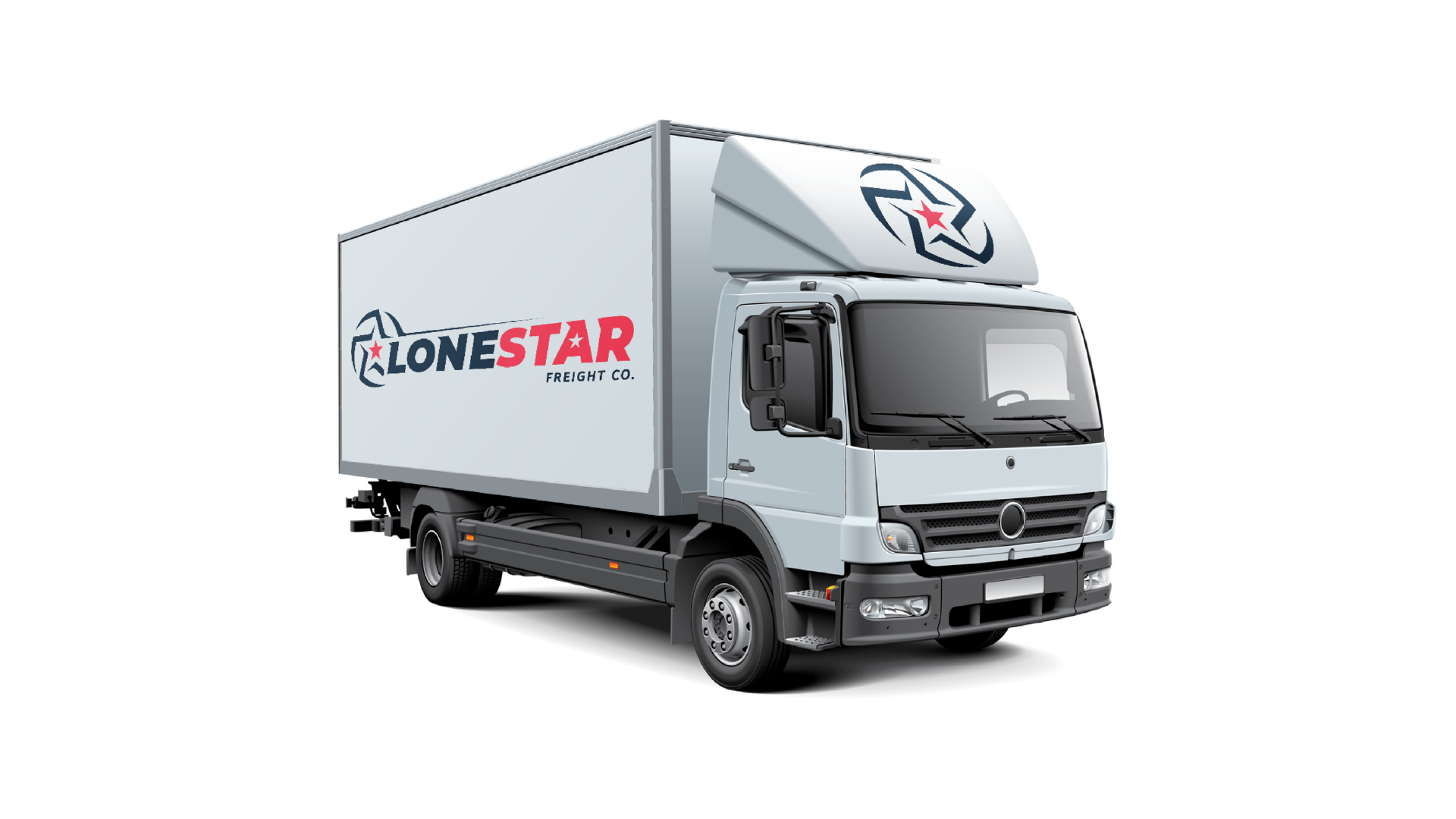
LONESTAR Trucking freight CO. is a company from Houston Texas that provides heavy haul carrier services. The Company offers logistic solutions to aerospace, construction, oil and gas, and renewable energy markets. Lone Star Trucking serves clients in the United States.

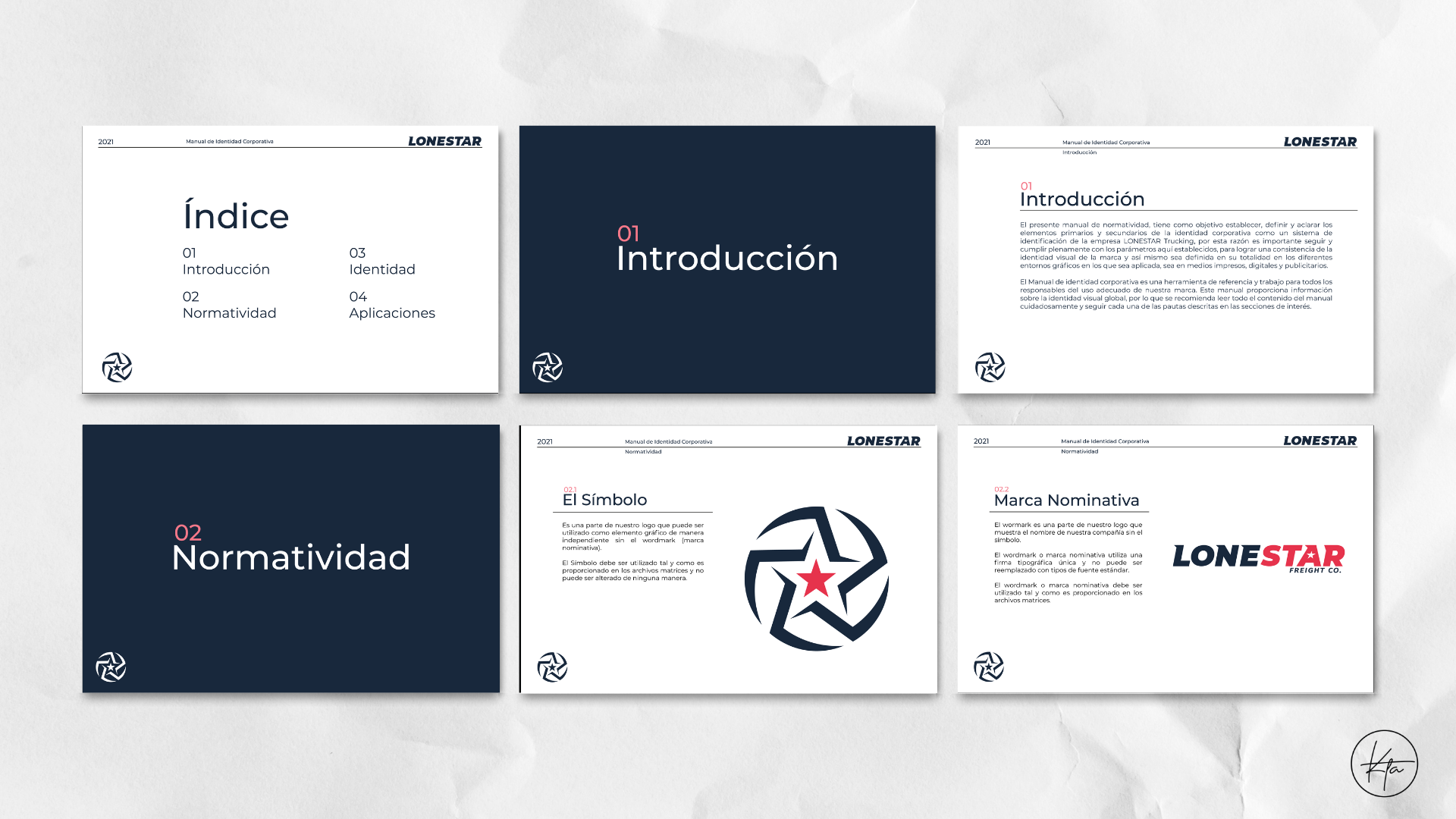
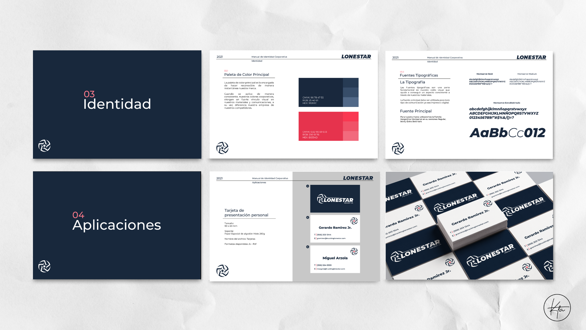
My job was to redesign the visual identity of the brand and deliver a corporate identity manual.
The client required a redesign to make their logo more professional and appealing to the customers but they wanted me to conserve the originality aspect of the current design.
I had to make a few changes in order to achieve the requirements. First I redid the symbol to make it look thinner and sharper at the ends of the circle to add movement and dynamism to the logo. For the font, I used Montserrat Extra Bold Italic and added a sharp triangle shape at the top of some of the letters to add movement to the name and make it blend with the symbol. Finally, I also opted to change the color pallet to more sophisticated shades of blue and red to make it look more aesthetic and visually appealing.

original logo
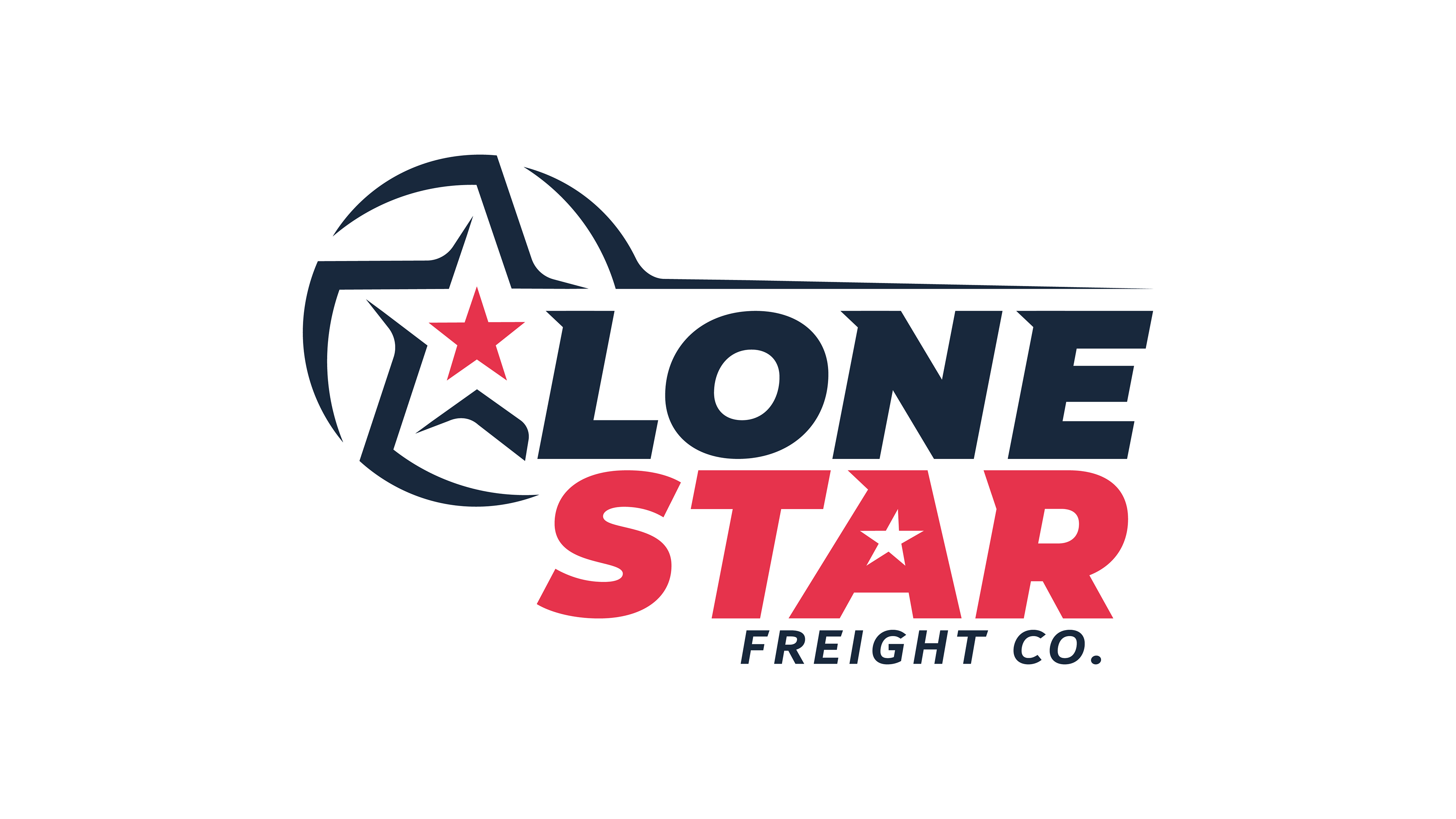
redesign
Location: Monterrey, México.
Service: Branding & Corporate identity manual.
Softwares: Illustrator and Photoshop.